Creative
AI Character Sheet Prompts: Design a Character and Keep It Consistent
Design the character in one image, turn that image into a character sheet, then attach the sheet to keep the character consistent. Prompt templates and examples for five styles.
By John P. Jochem · · 15 min read
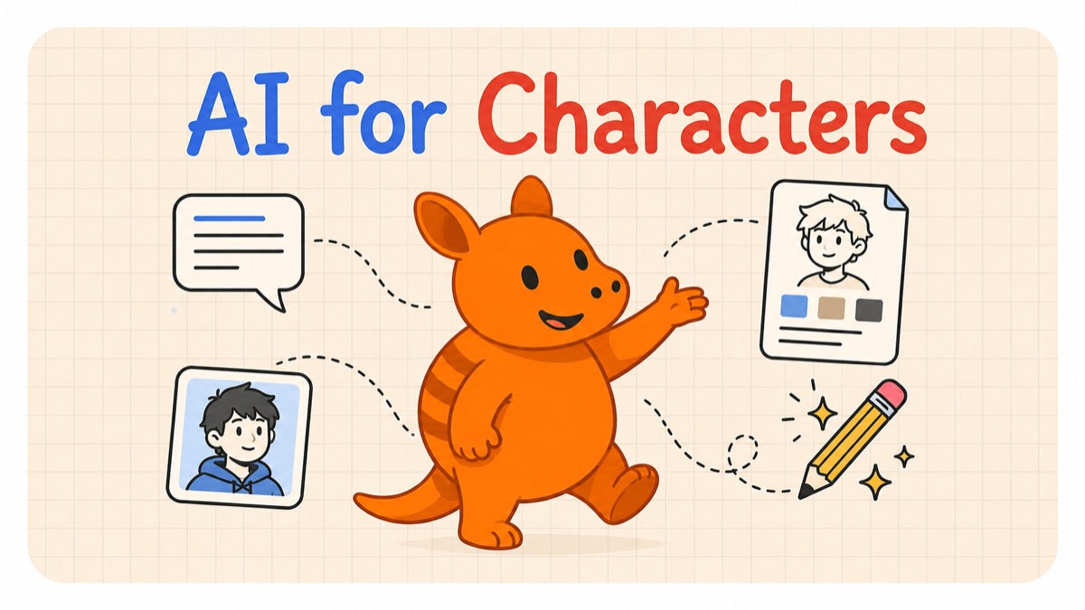
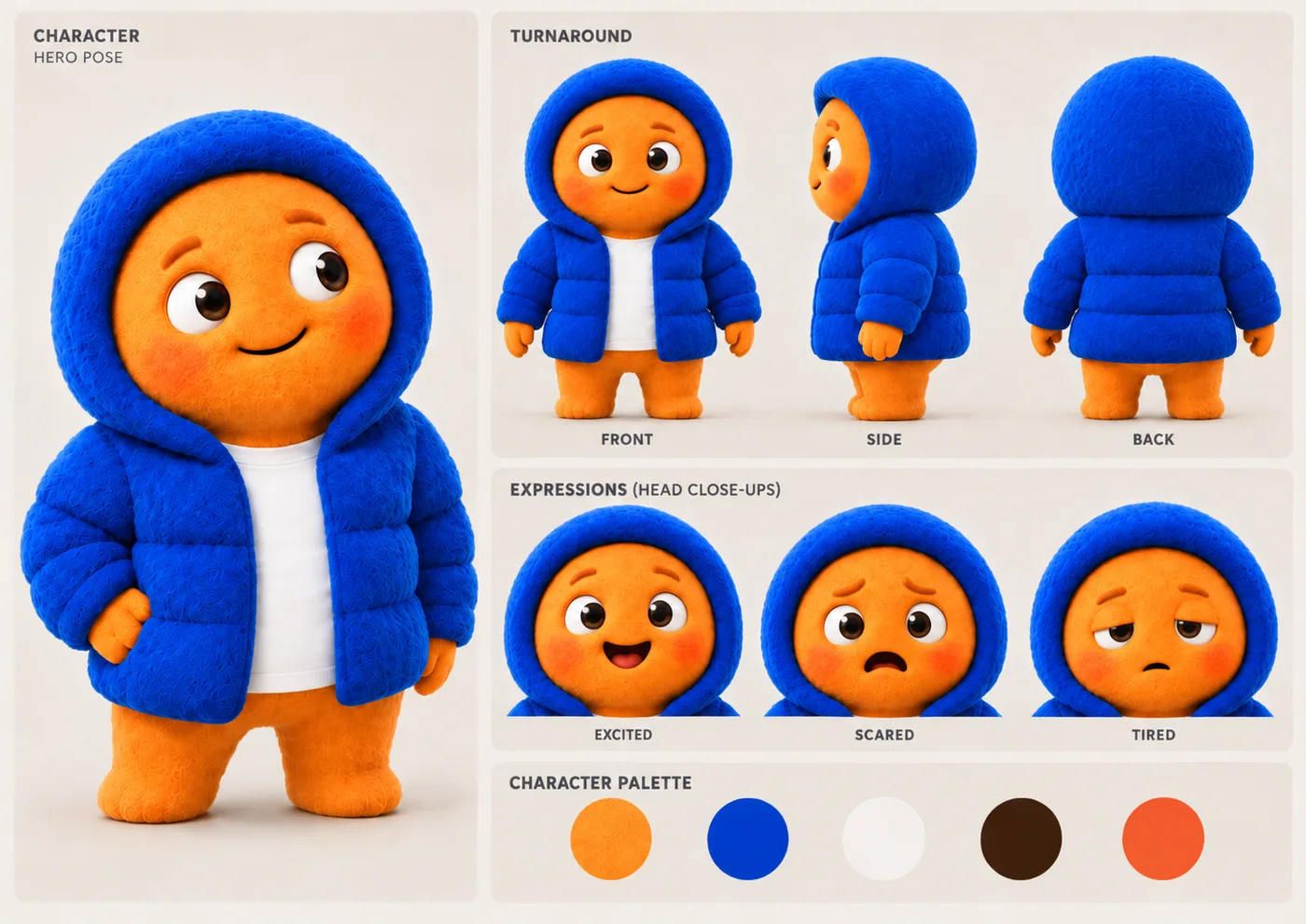
A character sheet, also called a model sheet or reference sheet, shows one character from several angles in a single image, usually with a few facial expressions and the character's colors. In AI image work, it's the reference that keeps a character looking the same from one picture to the next. You attach the sheet to a prompt, and the model has the exact design to copy.
The process takes three prompts. Asking for a new character and a full sheet in one prompt makes the model invent the design while it draws every view. Splitting the job means the sheet copies a character you've already approved, and every later image copies the sheet.
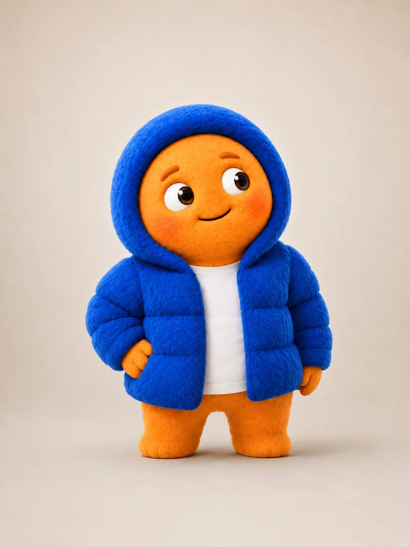
- Design the character. Fill in one of the AI character prompts by style and generate a single full-body image on a plain background. Regenerate until you like it.
- Turn it into a character sheet. Attach that image to the character sheet prompt to get front, side, and back views, expressions, and a color palette.
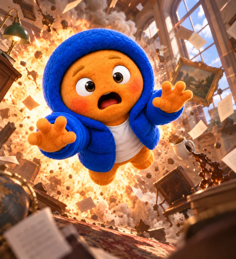
- Use the sheet for every new image. Attach the sheet and direct the scene: where the character is, how they feel, and what they're doing.
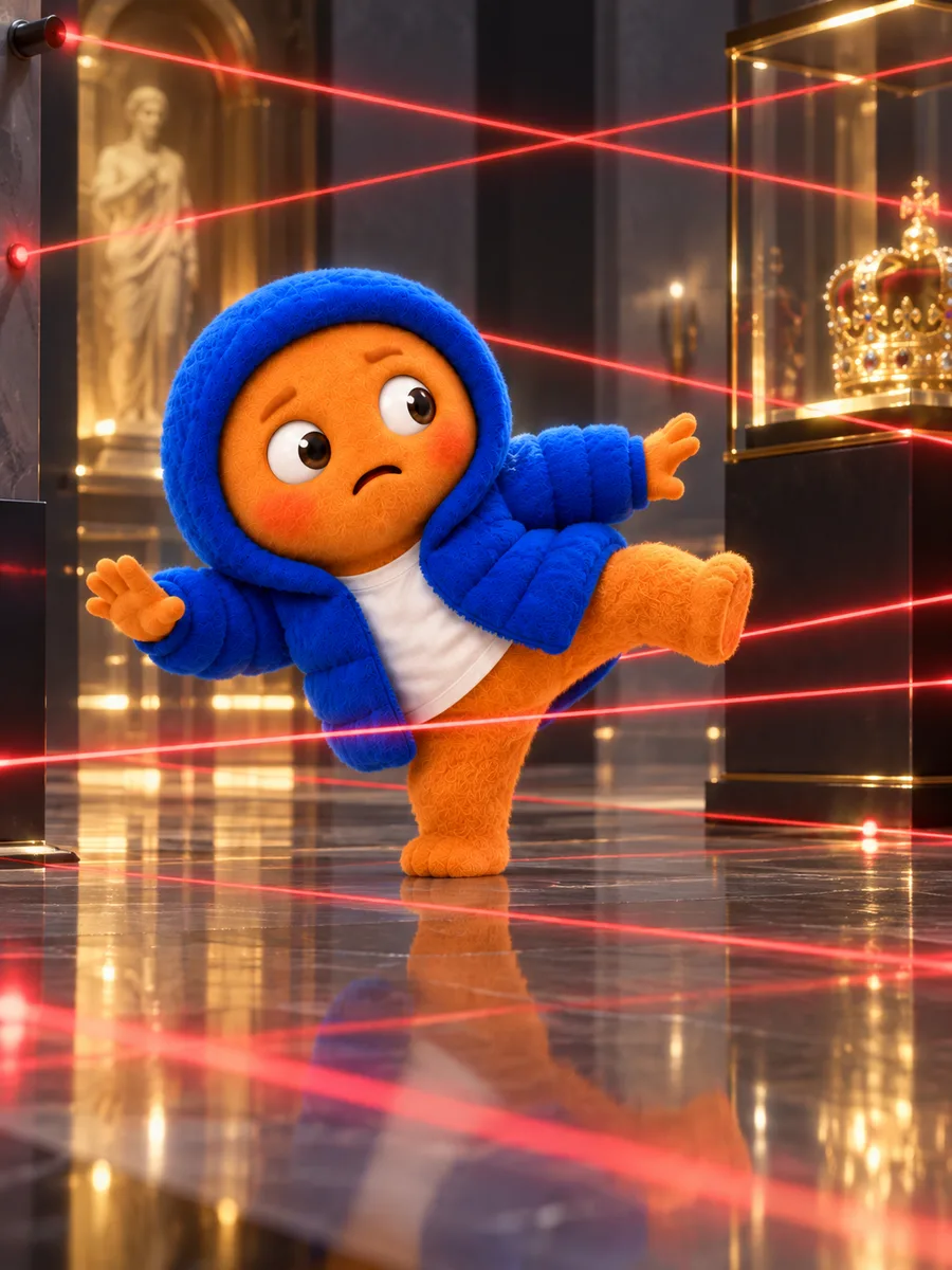
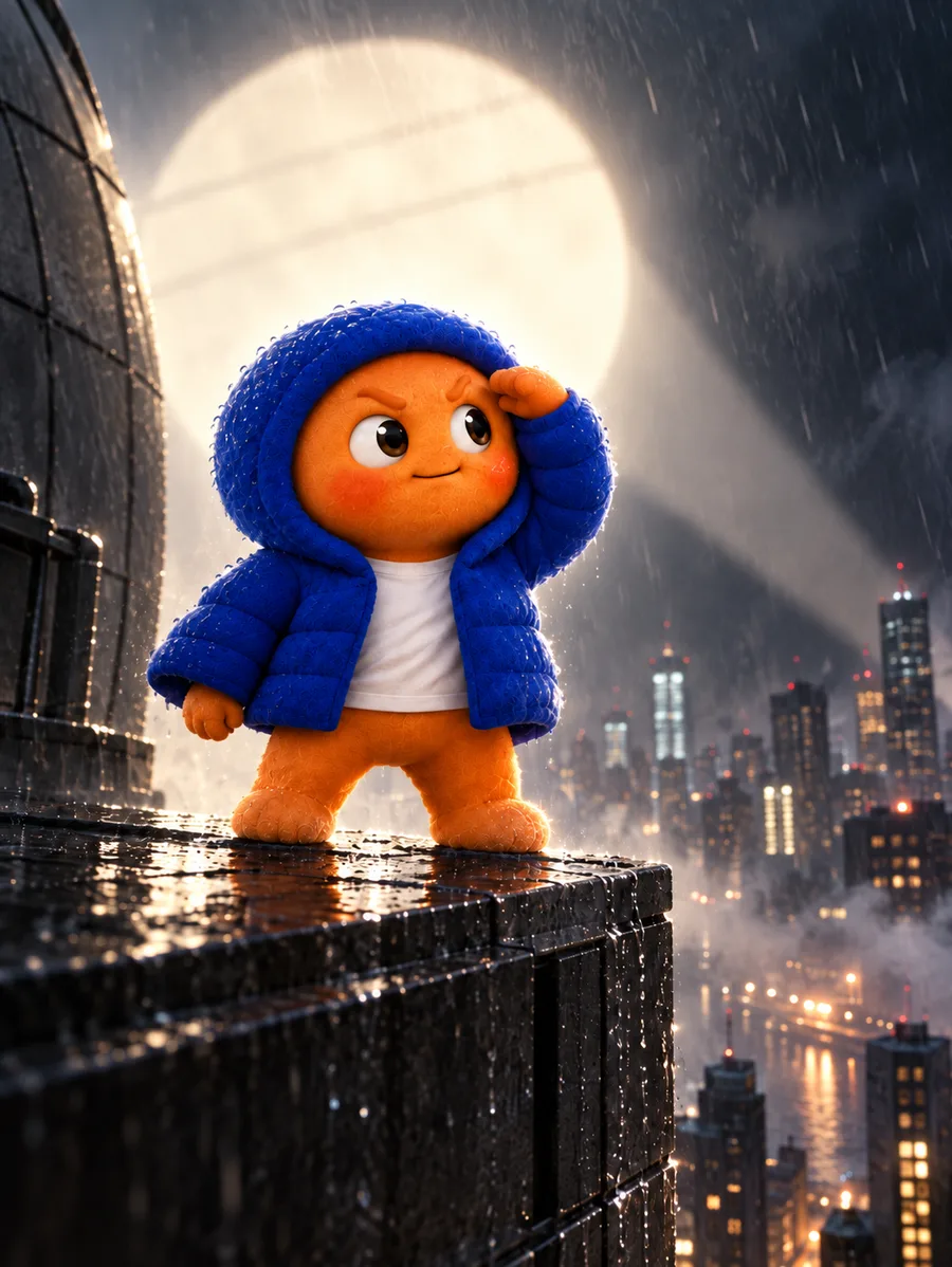
Step 1: Design the character
Start with one image of the character, full body and head to toe, on a plain background. The sheet in step 2 can only copy what this image shows. Anything cropped out or hidden behind a prop gets made up, and anything in the background is something the model may carry into the sheet. The setting belongs in the scene prompts of step 3. OpenAI's image prompting guide builds its storybook example the same way: the character first, on a simple background, then that image as the reference for each new scene.
A character prompt comes down to seven decisions, and each one is a labeled line in the templates.
1. Character. Who they are, what story or brand they belong to, and a few words for their personality, including what they should never come across as. "Milo, an 11-year-old goalkeeper for the worst youth soccer team in town, the main character of an animated sports comedy" gives the model a person to design. "A boy who plays soccer" leaves the design to the model.
2. Look. Build, skin, hair, and face, described plainly: "small and skinny, with a big round head, messy black hair, and a gap between his front teeth."
3. Outfit. The specific clothes, colors, and materials. "A jacket" could be a different jacket every time.
4. Colors. The main colors, by name, with hex codes if you're matching brand colors. Colors you leave out get chosen for you, and they can change between images.
5. Style. How the image is rendered: the medium, the linework or lighting, and the texture. Each template has this line written for its style, with a blank where the choice is yours.
6. Framing. The pose and expression, an aspect ratio that holds the whole character, like a 4:5 portrait for a humanoid character, and a clean background that contrasts with them, like a plain white or light gray studio background.
7. Avoid. Clichés the character could slide into, like influencer posing, plus a face that resembles a real or famous person, features copied from an existing character, and props you didn't ask for.
Weak vs. strong
Weak:
Make an image of a lightkeeper's daughter for my picture book.
The same idea, with all seven decisions made:
Create a single full-body image of an original character.
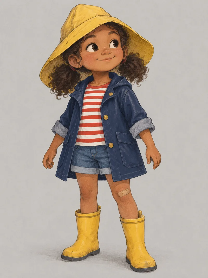
Character: Rosie, the 7-year-old daughter of a lightkeeper, who wants to keep the light herself one day, the main character of a children's picture book. Personality: curious, brave, kind; never bratty.
Look: small and sturdy, with light brown skin, big dark eyes, two puffy pigtails, and a bandage on one knee.
Outfit: a navy raincoat with the sleeves rolled up over a red-and-white striped shirt, denim shorts, and yellow rain boots, with her father's yellow rain hat, much too big for her.
Colors: navy, sunflower yellow, red, and white.
Style: soft 2D picture-book illustration, gentle pencil outlines, gouache texture, warm muted colors.
Framing: a vertical 3:4 image of the whole character from head to toe, standing in a relaxed pose with arms slightly away from the body, turned slightly to one side, with a determined little smile, on a plain light gray background with soft, even light.
Avoid: a generic or stock-looking design, a face that resembles a real or famous person, features copied from an existing character, and props or accessories that aren't described.
Each labeled line is one decision. The lighthouse is left out on purpose. Once Rosie has a sheet, it goes into a scene prompt.
AI character prompts by style
These are step 1 prompts with the style line written for each style. Each one opens on a finished example; choose Template for the version with blanks, replace the words in brackets, and keep everything else. Copy copies whichever version is showing. Paste it into ChatGPT or Gemini.
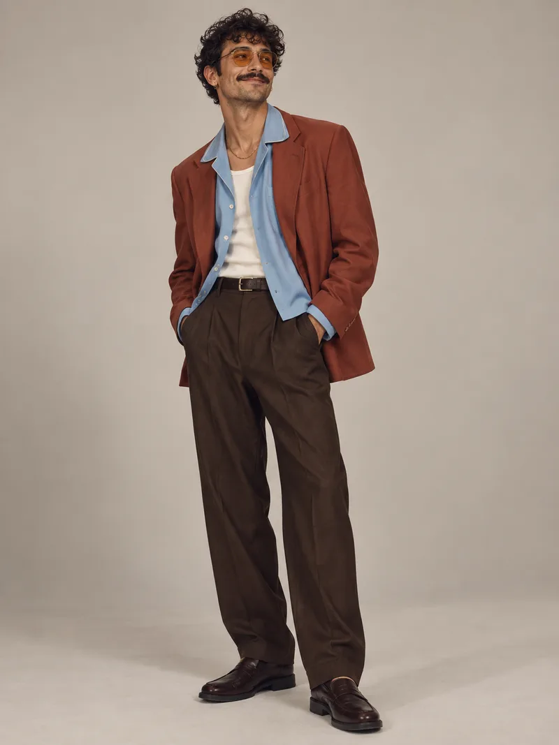
Photoreal
For characters who need to look like real people: the lead of a live-action story, a recurring face for a campaign, a character for AI video.
Template
Create a single full-body image of an original character.
Character: [NAME], [WHO THEY ARE], the main character of [WHAT THEY'RE IN]. Personality: [A FEW WORDS]; never [WHAT THEY SHOULD NEVER COME ACROSS AS].
Look: [BUILD, SKIN, HAIR, AND FACE].
Outfit: [SPECIFIC CLOTHES, COLORS, AND MATERIALS].
Colors: [MAIN COLORS].
Style: photorealistic editorial photograph, 85mm lens, soft diffused studio light, true-to-life skin texture with small imperfections, real fabric detail, restrained retouching.
Framing: a [ASPECT RATIO] image of the whole character from head to toe, [POSE], with [EXPRESSION], on [A CLEAN BACKGROUND THAT CONTRASTS WITH THE CHARACTER].
Avoid: [CLICHÉS THIS CHARACTER COULD SLIDE INTO], a face that resembles a real or famous person, features copied from an existing character, and props or accessories that aren't described.
Write the character like a casting call: age, job, and the details that make their face and clothes their own.
Semi-real (painted)
For story characters with a hand-drawn, painted look: picture books, novels, and games.
Template
Create a single full-body image of an original character.
Character: [NAME], [WHO THEY ARE], the main character of [WHAT THEY'RE IN]. Personality: [A FEW WORDS]; never [WHAT THEY SHOULD NEVER COME ACROSS AS].
Look: [BUILD, SKIN, HAIR, AND FACE].
Outfit: [SPECIFIC CLOTHES, COLORS, AND MATERIALS].
Colors: [MAIN COLORS].
Style: [KIND OF ILLUSTRATION], gentle pencil outlines, [PAINT MEDIUM] texture, [COLOR MOOD] colors.
Framing: a [ASPECT RATIO] image of the whole character from head to toe, [POSE], with [EXPRESSION], on [A CLEAN BACKGROUND THAT CONTRASTS WITH THE CHARACTER].
Avoid: [CLICHÉS THIS CHARACTER COULD SLIDE INTO], a face that resembles a real or famous person, features copied from an existing character, and props or accessories that aren't described.
Fill in the kind of illustration you want, like a picture book or a book cover, and the paint medium, like gouache or watercolor.
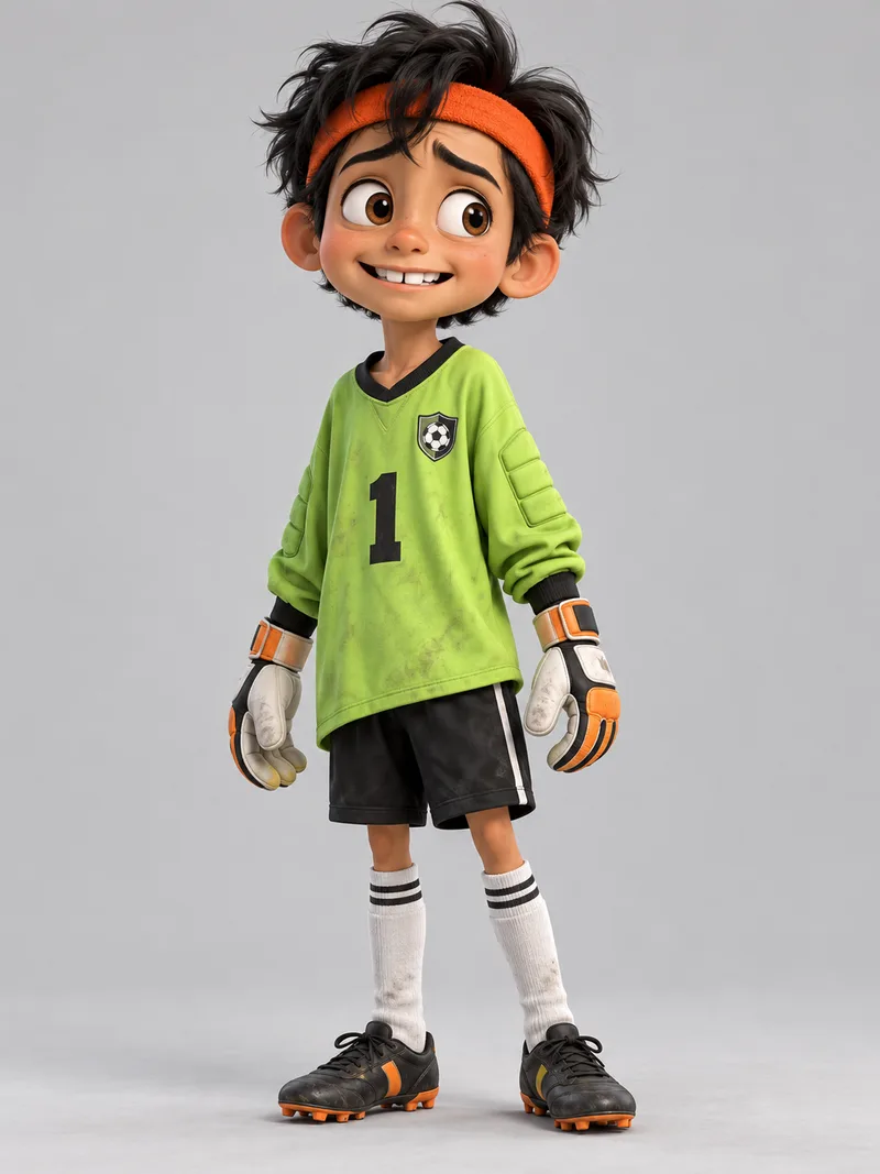
3D / CGI
For leads in animated films and shorts, app characters, and game prototypes.
Template
Create a single full-body image of an original character.
Character: [NAME], [WHO THEY ARE], the main character of [WHAT THEY'RE IN]. Personality: [A FEW WORDS]; never [WHAT THEY SHOULD NEVER COME ACROSS AS].
Look: [BUILD, SKIN, HAIR, AND FACE].
Outfit: [SPECIFIC CLOTHES, COLORS, AND MATERIALS].
Colors: [MAIN COLORS].
Style: 3D animated-film look with [MATERIAL] textures, rounded appealing forms, an expressive face, soft global lighting.
Framing: a [ASPECT RATIO] image of the whole character from head to toe, [POSE], with [EXPRESSION], on [A CLEAN BACKGROUND THAT CONTRASTS WITH THE CHARACTER].
Avoid: [CLICHÉS THIS CHARACTER COULD SLIDE INTO], a face that resembles a real or famous person, features copied from an existing character, and props or accessories that aren't described.
Fill in the material, like soft fabric and skin, felt, or clay. The same description comes out differently in each.
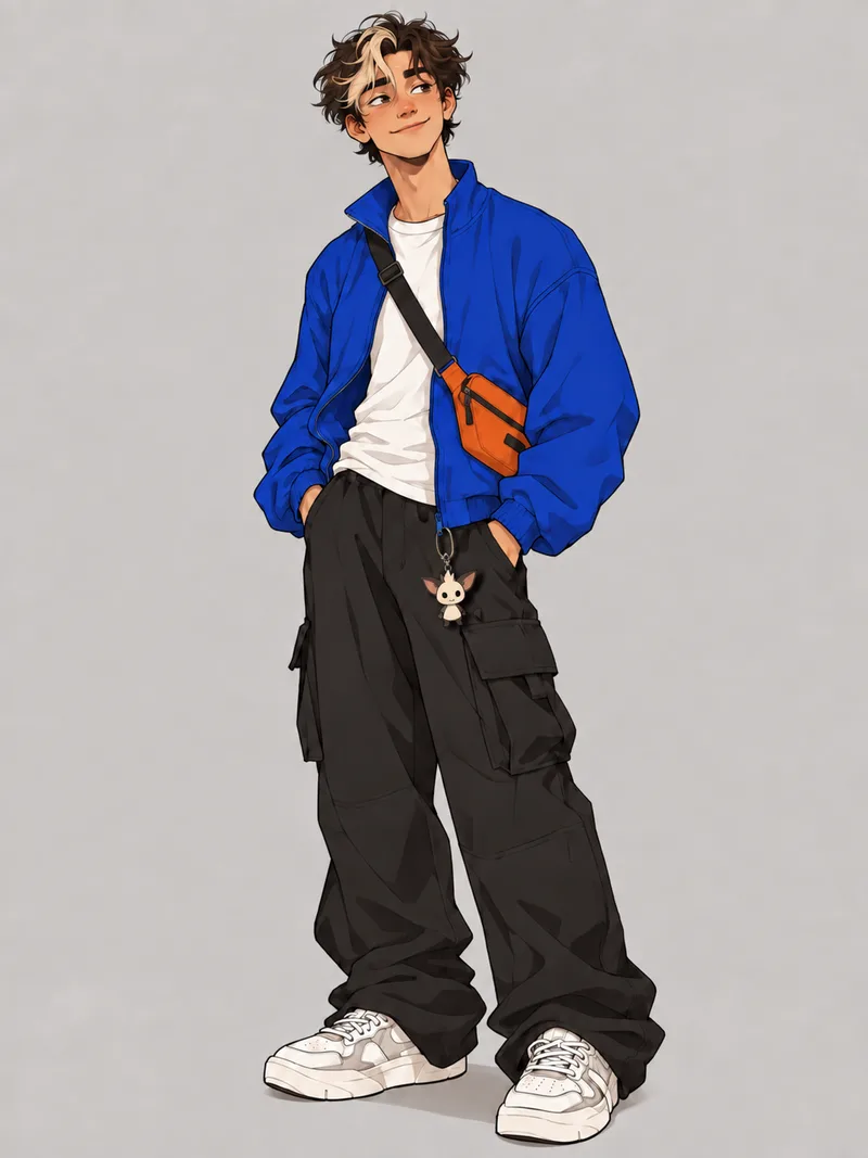
2D animation
For characters that will appear in many images: animated series, comics, children's books, social posts.
Template
Create a single full-body image of an original character.
Character: [NAME], [WHO THEY ARE], the main character of [WHAT THEY'RE IN]. Personality: [A FEW WORDS]; never [WHAT THEY SHOULD NEVER COME ACROSS AS].
Look: [BUILD, SKIN, HAIR, AND FACE].
Outfit: [SPECIFIC CLOTHES, COLORS, AND MATERIALS].
Colors: [MAIN COLORS].
Style: bold 2D cartoon style, thick clean outlines, flat colors, exaggerated proportions, and simple graphic forms.
Framing: a [ASPECT RATIO] image of the whole character from head to toe, [POSE], with [EXPRESSION], on [A CLEAN BACKGROUND THAT CONTRASTS WITH THE CHARACTER].
Avoid: [CLICHÉS THIS CHARACTER COULD SLIDE INTO], a face that resembles a real or famous person, features copied from an existing character, and props or accessories that aren't described.
Bold shapes and flat color are easier to keep the same across many images.
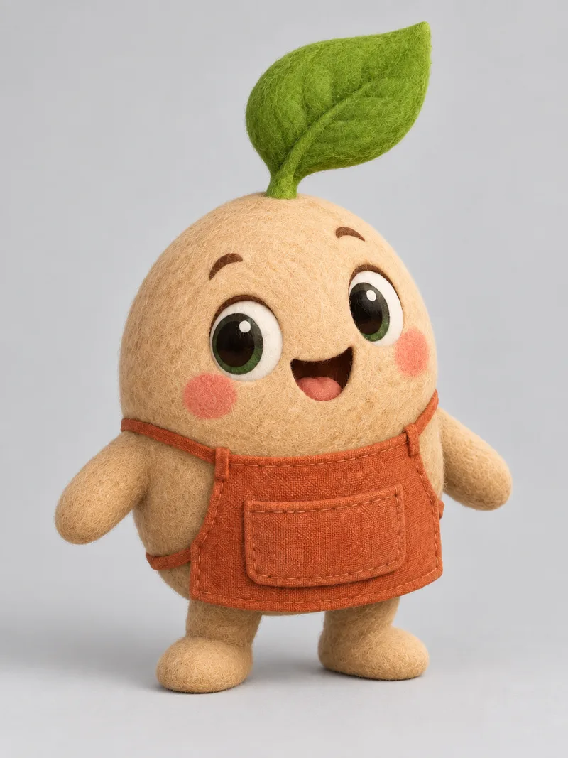
Mascot
For brand characters that need to work everywhere, from packaging to a small app icon.
Template
Create a single full-body image of an original mascot character.
Character: [NAME], a [ANIMAL, OBJECT, OR CREATURE], the mascot of [BRAND]. Personality: [A FEW WORDS]; never [WHAT IT SHOULD NEVER COME ACROSS AS].
Look: [BODY SHAPE AND FACE], with a silhouette that stays recognizable at small sizes.
Outfit: [CLOTHING OR ACCESSORIES, IF ANY].
Colors: [MAIN COLORS].
Style: [MASCOT LOOK AND MATERIAL], simple rounded shapes, a big expressive face, soft studio light.
Framing: a [ASPECT RATIO] image of the whole character from head to toe, [POSE], with [EXPRESSION], on [A CLEAN BACKGROUND THAT CONTRASTS WITH THE CHARACTER].
Avoid: [CLICHÉS THIS MASCOT COULD SLIDE INTO], features copied from an existing mascot or character, and accessories that aren't described.
Fill in the mascot's look and material, like flat vector, soft 3D, or felted wool. Before you make the sheet, check the image at thumbnail size, since mascots end up in small places like app icons.
Step 2: Turn the character into a character sheet
Attach your character image and paste this prompt.
Template
Using the attached image, create a character reference sheet of this exact character as one wide 16:9 landscape page on a plain, light neutral background, divided into clearly separated panels:
- A large left panel labeled "CHARACTER" with one full-body hero pose in three-quarter view
- A top-right panel labeled "TURNAROUND" with front, side, and back views, full body, all the same height and standing on one baseline, in a relaxed neutral pose with the arms slightly away from the body, labeled "FRONT", "SIDE", and "BACK"
- A middle-right panel labeled "EXPRESSIONS" with three head close-ups showing [EXPRESSION 1], [EXPRESSION 2], and [EXPRESSION 3], each labeled with its expression
- A bottom-right panel labeled "COLOR PALETTE" with five flat color swatches taken from the character
Keep the character identical to the attached image in every panel: the same face, hair, proportions, outfit, colors, and rendering style, with every detail on the same side of the body in every view. Don't add accessories, markings, or other details that aren't in the attached image. Spell every label exactly as written.
The turnaround views use a neutral pose on purpose. When the character stands the same way in every view, it's easy to see whether the views match. The hero pose is where the personality goes.
If the character holds something, give the props a panel of their own. Add this line to the list, next to the color palette panel or in place of it:
- A panel labeled "PROPS" with [PROPS] shown on their own, and empty hands in the turnaround views
A prop in the hand has to match in every view, and it can switch hands, change size, or disappear between them. In its own panel, it's drawn once, where you can check it.
Check the sheet before you use it. Compare every view with your original image: face, hair, outfit details, colors, proportions. Look hardest at the back view, since your original image never showed the back and the model had to make it up. Fix anything that's off with a one-line follow-up in the same chat, then download the sheet. That file is what you'll attach from now on.
Need only the angles? A turnaround, sometimes called a multi-angle reference, leaves out the expressions and color palette, which gives each view more room:
Using the attached image, create a turnaround of this exact character: front, three-quarter, side, and back views in one row, full body, all the same height and standing on one baseline, in a relaxed neutral pose, with every detail on the same side of the body in every view. Plain, light neutral background, even lighting, and a small label under each view: "FRONT", "THREE-QUARTER", "SIDE", "BACK". Keep the same face, hair, proportions, outfit, colors, and rendering style in every view.
For more expressions, stay in the same chat and follow up with: "Now a 3×3 grid of head close-ups of the same character showing nine different expressions, with the same face and hair in each."
Step 3: Keep the character consistent in new images
Direct each new image the way you'd direct an actor. Attach the sheet, then say where the character is, how they feel, what they're doing, and how the shot is framed.
Show the character from the attached character sheet in an old wood-paneled study in the middle of an explosion, with a scared expression, flying backward with arms flung out as books, papers, and a spilling coffee cup fly past, as a dramatic low-angle shot in a vertical 4:5 frame. From the sheet, keep the face, proportions, outfit, and colors exactly the same, and change only the pose and expression. Match the scene to the character's style, and light the character with the scene's light so they belong in it. Make one image with the character in it once, without the sheet's labels, color swatches, or extra poses.
Template
Show the character from the attached character sheet in [SCENE], with [EXPRESSION], [DOING WHAT], as [SHOT AND ASPECT RATIO]. From the sheet, keep the face, proportions, outfit, and colors exactly the same, and change only the pose and expression. Match the scene to the character's style, and light the character with the scene's light so they belong in it. Make one image with the character in it once, without the sheet's labels, color swatches, or extra poses.
A few habits keep the character steady from here:
- Change one thing at a time, in the same chat. "Same scene, but looking back over the shoulder" edits the last image. OpenAI's prompting guide recommends saying what to change, saying everything else stays the same, and repeating what must stay the same on each edit.
- Start a new chat when the character drifts. Each follow-up edits the last image, so small changes pile up. Start a new chat, attach the sheet again, and run the scene prompt fresh.
- For two characters, attach both sheets and say which is which. "Image 1 is the first character's sheet. Image 2 is the second character's sheet." Google's documentation lists up to five character reference images for Nano Banana Pro.
Expect the same character with small differences rather than identical copies, like a strap on the other shoulder or a slightly different shade.
For video or comic planning, Storyboard Maker takes a character sheet as one of up to four reference images and draws a multi-panel storyboard with the character in it.
Which AI image model to use
Steps 2 and 3 both work from an attached image, so the model needs to keep a subject from a reference and handle follow-up edits. Two current options:
GPT Image 2.5, in ChatGPT. OpenAI's newest image model, released in September 2026 as ChatGPT Images 2.5 and available on every ChatGPT plan, including free. OpenAI says it's better at preserving the subjects in your reference photos and follows editing instructions more reliably across multiple turns. Those are the two things this method leans on: the sheet copies your character image, and the follow-ups happen in the same chat. OpenAI's announcement has the details.
Nano Banana Pro, in Gemini. Google's Gemini 3 Pro Image model, which Google describes as having higher consistency and more precise creative control. In the Gemini app it needs a Google AI plan. Generate an image with the Gemini model set to Pro, then choose More and Redo with Pro. Without a plan, Gemini makes images with Nano Banana 2, which also accepts multiple reference images. Skip the Flash-Lite setting for this work, since Google says its image model isn't designed for multiple image references or multiple edits. A sheet squeezes many small views into one image, so resolution helps. Gemini downloads at 2K with a Google AI plan and 1K without. Gemini Apps Help lists the current options.
Use the one you already have. If a sheet keeps drifting in one, run the same prompt in the other.
Frequently asked questions
What is an AI character sheet?
A character sheet, also called a model sheet or reference sheet, is one image that shows the same character from several angles, usually front, side, and back, often with facial expressions and a color palette. With AI image models it works as a reference: attach it to a prompt, and the model has an exact design to copy, which keeps the character consistent across new images.
What is the best prompt for a character sheet?
One that starts from an image of the character instead of text alone. Attach the image and ask for separate labeled panels: a large hero pose, a front, side, and back turnaround at the same height, three expression close-ups, and a color palette, with the same face, hair, proportions, outfit, colors, and rendering style in every view. The sheet then copies a design you've already approved instead of inventing one while it draws every view.
How do I keep an AI character consistent across multiple images?
Make a character sheet from an image of the character you're happy with, then attach the sheet to every new prompt and ask for the same face, proportions, outfit, and colors, with only the pose and expression changing. Fix small differences with one-change follow-ups in the same chat, and when the character starts to drift, start a new chat and attach the sheet again. Expect the same character with small differences rather than identical copies.
Should I remove props from a character's hands for a multi-angle character sheet?
For the turnaround views, yes. A prop in the hand has to match in every view, and it can switch hands, change size, or disappear between them. Give the props a panel of their own on the sheet, next to the color palette or in place of it, and ask for empty hands in the turnaround. If the prop is part of who the character is, keep it in the hero pose.
Can ChatGPT make a character sheet?
Yes. Attach an image of your character in ChatGPT and paste a character sheet prompt. ChatGPT makes images with GPT Image 2.5 on every plan, including free. Gemini can do the same with Nano Banana 2, or with Nano Banana Pro on a Google AI plan.
Can I copyright a character I made with AI?
In the US, the Copyright Office says AI-generated material is protected only where a human author has determined sufficient expressive elements, and prompts alone don't meet that bar. What you add yourself, like your own drawing, edits, or arrangement, can be protected. A trademark is a separate question that depends on the mark and how it's used, not on whether AI was involved. If a character matters to your business, get legal advice.
Related Articles
Tags
- AI prompts
- character design
- character sheet
- brand mascot
- AI images
- AI image generation
- ChatGPT
- Nano Banana
- reference images
- visual content