Creative
AI Prompts for Product Photography: Listings and Social Posts
Create studio, tone-on-tone, lifestyle and detail images from a product reference, with copy-paste prompts and a guide to checking the results.
By John P. Jochem · · 19 min read
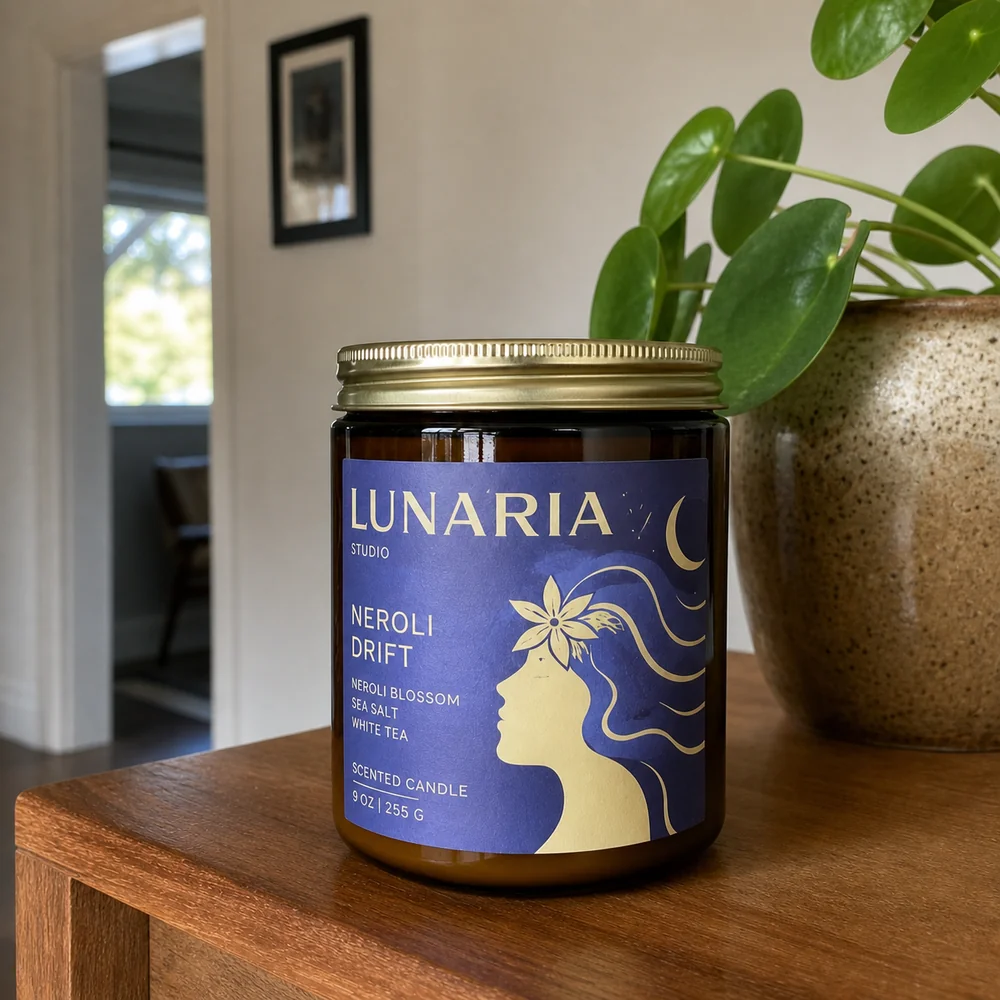
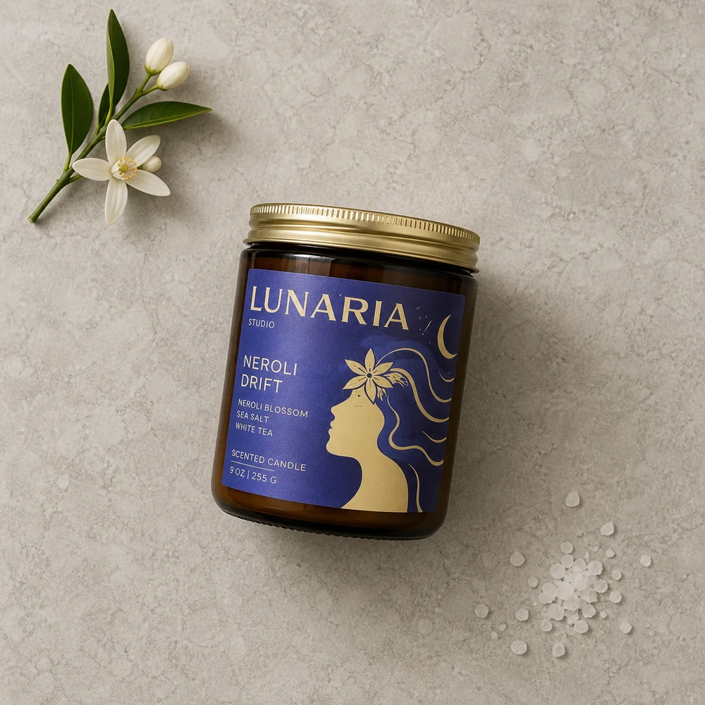
Use these AI product photography prompts to turn a product reference into a clean studio image, a tone-on-tone portrait or a natural lifestyle scene for your store and social posts. Upload a photo of the product you actually sell, then describe the photograph you want—not a new version of the product.
The first seven prompts cover specific photo styles. Number eight helps you write original product-photography prompts tailored to your product. You'll also find guidance for checking labels, fixing mismatches and adapting an image for its destination.
A reference gives the model something specific to work from. It doesn't guarantee an exact reproduction. Before using an image, compare its label, shape, color and small details with your original product.
How to use these prompts
- Upload a clear product photo to an image tool that accepts references, such as a supported ChatGPT Images, Gemini/Nano Banana or FLUX editing workflow.
- Choose a prompt from 1–7. Replace
[product]with a short description, such as “the amber candle,” and fill in any other brackets. Each prompt works on its own. - Generate the image, then compare the product with your original. Save both files and the prompt you actually used.
Start with Studio clean for a straightforward product view, Tone-on-tone studio for a softer branded look, or Natural lifestyle to show the product in context. Number eight is different: paste it into a text chat that can inspect your photo, then take one of the prompts it writes into your image tool.
Choose the output shape in the tool's settings where available. A prompt asking for a tall composition won't necessarily change the exported dimensions.
Keep the product's design, but let the new scene change how light and reflections fall across it. You're asking for a photograph of the product in that setting, not the original lighting carried into a different room. Start with a reference close to the viewing angle you want. Flat lays and detail shots have their own reference notes below.
Choose a photo style for your listing or post
| Image you need | Prompt |
|---|---|
| A clear product view on a neutral background | 1. Studio clean |
| A soft, color-coordinated image for a product page or post | 2. Tone-on-tone studio |
| The product in a believable everyday setting | 3. Natural lifestyle |
| A punchier product image for a feed post or launch | 4. Bold color, hard light |
| A darker editorial portrait for a feature image | 5. Dark studio |
| An overhead arrangement for a post or secondary listing image | 6. Editorial flat lay |
| A closer view of an actual material or feature | 7. Product detail |
| Original photo directions written for your specific product | 8. Abstract product-photography prompt writer |
A listing image should help someone inspect the product; a lifestyle image gives it context; a social image can be more expressive. You don't need all eight. For a small starting set, choose one clean view and one lifestyle or studio variation. This distinction between white-background, studio, lifestyle and detail photography also appears in Shopify's product-photography guide.
The scene should make sense for the product. Props can imply ingredients, included accessories or uses: include those associations only when they're accurate. A generated room also isn't proof of product size; provide actual dimensions when scale matters and inspect the result.
Eight copy-paste prompts for product photography
The reference supplies the product's identity. The prompt supplies the set, light and composition. “No added text” means no headline or graphic overlay—not removing the words already printed on the product.
1. Studio clean
For a clear, uncluttered product view. The default is white; use light gray instead when you want a neutral studio look rather than a white-background image.
Create one clean studio product photograph of the [product] in the attached reference. Use the reference for its silhouette, proportions, materials, true colors, packaging and visible label lettering. Keep the same product view and configuration; replace the original surroundings.

Place the product on a smooth white surface that curves into a seamless white background. Show the complete product prominently, with comfortable margins and a natural camera perspective. Nothing else is on the set.

Use a large diffused studio light from upper left and gentle fill from the right. Let the light wrap around the product, with a soft grounded shadow and clear separation along its edges. Glass should remain transparent, metal reflective and matte surfaces matte, as shown in the reference. Adapt highlights and reflections to this white set rather than retaining those from the original room. Keep the whole product in crisp focus without a glowing outline.

The result should look photographed on this set. Add no headline, badges or graphics; retain the product's existing label text.
Check pale edges and transparent materials carefully. For a marketplace listing, check that marketplace's current image requirements before using the result; a white background alone doesn't establish compliance.
2. Tone-on-tone studio
For a cohesive product-page image or social post where the background complements the product rather than competing with it.
Create one tone-on-tone studio photograph of the [product] in the attached reference. Preserve its silhouette, proportions, materials, actual colors, packaging and visible label lettering. Keep the reference viewing angle and product configuration.

Build a seamless paper sweep in one muted color related to a prominent color already present in the product or packaging. Use a lighter or darker shade so its silhouette remains distinct. The ground and backdrop share that color family; the product itself is not recolored. Keep the set empty, with no props or decorative shapes.

Use one large diffused light about 45 degrees to the left and a gentle fill that keeps the shadows soft and open. Let the tone fall off gradually behind the product, with a small contact shadow where it rests. Match the product's reflections and highlights to this softly lit set, preserving its real finish and readable label.

Frame the complete product slightly off-center, prominent rather than tiny, with calm open space around it. Aim for a soft, dimensional product portrait, not a flat silhouette. Add no text or graphics beyond the existing packaging print.
For a multicolored product, choose one packaging color for the set. Tone-on-tone describes the relationship between the colors; it isn't an instruction to tint the whole image.
3. Natural lifestyle
For showing where the product belongs in someone's day. Use a setting that fits your product; you don't need a kitchen counter for everything.
Create one natural lifestyle product photograph of the [product] from the attached reference. Preserve its design, proportions, materials, true colors, packaging and visible label lettering. Use the product only, not the reference photo's original background or incidental props.

Photograph it in [a place where this product is normally used or kept]. Let that place determine the supporting surface, surrounding materials and light. Add one or two quiet signs of everyday life that belong there, leaving the product unobstructed. Keep it in the same configuration as the reference, resting naturally rather than being held or activated.

Use soft directional daylight from one side. The product and its surroundings share the same light direction, warmth and shadow softness. Reflections should come from this environment, and the product should make believable contact with its supporting surface. Keep the product and the surface immediately around it in focus while the more distant surroundings soften naturally.

Use a view close to the reference, with believable proportions relative to the setting. Make the product the clear subject of a relaxed editorial photograph, not an isolated cutout pasted into a room. Add no headline or graphics; keep the original packaging text.
For a candle, fill in “a light oak side table beside a linen sofa” and add “Keep the candle unlit.” For coffee, a breakfast counter may fit; for a desk accessory, use a working desk. Choose the context rather than copying someone else's props.
4. Bold color, hard light
For a punchier social post or launch image. Unlike tone-on-tone, this uses contrasting color and a defined shadow.
Create one bold commercial product photograph of the [product] in the attached reference. Keep its silhouette, proportions, materials, actual colors, packaging and visible label lettering faithful to the reference. Keep the same product view.

Use a smooth, saturated [background color] paper sweep, with the same color across the supporting surface and backdrop. Choose a color that clearly contrasts with the product. Keep the set empty so the product's shape and its shadow carry the composition.

Light the scene with one direct studio light from upper left, creating a crisp shadow that extends diagonally to the right from the product's actual contact point. Use restrained fill so the shaded side and label remain readable. Let the same light create convincing highlights on the product; retain its real texture and finish rather than giving every surface a plastic shine.

Frame the complete product confidently with room for the shadow inside the image. Keep the product and the nearby surface sharp, with clean color and controlled contrast. Make it feel like a single photographed set. Add no text, stickers or graphic overlays; preserve the existing packaging print.
5. Dark studio
For an editorial portrait of fragrance, candles, accessories or other products whose shape and finish suit a darker setting.
Create one dark editorial studio photograph of the [product] from the attached reference. Preserve its silhouette, proportions, materials, true colors, packaging and visible label lettering. Keep the same viewing angle and product configuration.

Place it on a dry charcoal stone surface against a background that falls gradually to near-black. Keep the set spare, with the product as the only object. Show the complete product prominently, with a small amount of breathing room.

Use a narrow diffused light from camera left to trace the product's form, with a low, soft fill on the front so the label and essential details remain readable. Let highlights follow the real material: broad and soft on matte surfaces, more defined on glass or polished metal. Retain detail in the darker edges instead of merging the product into the background.

Ground it with a contact shadow and reflections appropriate to the stone and product. Keep the product in crisp focus, with rich but believable contrast. The mood is quiet and tactile, not smoky or theatrical. Add no headline, graphics, mist or water droplets; preserve the original packaging text.
6. Editorial flat lay
For an overhead social post or secondary listing image. Start with a real top-down photo of the product in the arrangement you want to preserve; a front-view reference won't show all the details needed for an accurate overhead view.
Create one editorial flat-lay photograph using the [product] in the attached top-down reference. Preserve its visible shape, proportions, materials, colors, packaging and lettering. Keep the product's arrangement and orientation as shown, replacing only the surrounding set and adapting its lighting.

Shoot directly overhead onto one matte surface in a quiet neutral that complements the product. Arrange [one or two relevant props, or no props] near the edges, with intentional spacing and no overlap across the product. Keep the product dominant, with comfortable margins and no additional products or packaging.

Use broad, soft daylight from the upper-left edge of the set. Match that light across every object, with small natural contact shadows that show their thickness and how they rest on the surface. Keep the overhead perspective consistent and the product, props and surface in clear focus. Preserve real texture without exaggerated sharpening.

The result should feel like a carefully arranged photograph on one physical surface, not separate cutouts assembled into a collage. Add no headline, arrows or decorative lettering; retain words already on the product.
7. Product detail
For a closer look at a real finish, label or construction detail. Supply a sharp close-up that already shows it. If a crop of your original photo does the job, use that instead of generating another image.
Create one close-up product photograph of [the specific detail] on the [product], using the attached close-up as the detail reference. Preserve the actual shape, construction, texture, colors and any visible lettering. Show only detail that the reference resolves; do not invent finer grain, stitching, engraving or surface features.

Keep the reference viewing angle and frame the detail prominently, with enough of the surrounding product visible to understand what it is. Use a simple neutral background that does not compete with the subject.

Light it with a broad diffused source from the side to reveal the existing surface relief and finish, with gentle fill to keep important detail visible. Keep the entire featured detail sharp, allowing only more distant parts to soften. Highlights should follow the actual material, and any visible contact or reflection should belong to this lighting setup.

Aim for a clear, restrained detail photograph, without artificial sharpening halos or exaggerated texture. Add no arrows, explanatory labels, headline or graphics. Keep existing product lettering unchanged.
8. Abstract product-photography prompt writer
Use this when you want more distinctive photo directions tailored to your product. This prompt returns text: three complete image prompts. It does not generate a photo. Attach your product reference in a text chat that can inspect images, then paste the following:
Act as an abstract product photographer and set designer for cult brands. Your task is to WRITE three original product-photography prompts for the product in the attached photo. Return text only. Do not generate images, ad copy, captions or campaign plans.

Study the product's visible form, colors, materials and packaging. Use those qualities as creative starting points, not an excuse to invent ingredients, benefits or product features. Aim for distinctive editorial still-life photography: an art-directed physical set with one strong visual idea, not a random strange location or a generic luxury pedestal.

Write three genuinely different directions, each built around a clear relationship between the product and its surroundings. Commit to a specific surface or support, set materials, palette, composition and light source. Let the product remain the recognizable focal point, with an interesting but believable relationship to the set.

Each image prompt must be self-contained and ready to paste into an image generator with the same product reference attached. Include:
- The photographed product as the authority for its silhouette, proportions, true colors, materials, packaging and visible lettering. Preserve what it is while adapting light and reflections to the new set.
- A concrete scene, camera view, framing, lighting direction and softness. Stay close to a view supported by the reference rather than inventing hidden product details.
- Natural physical integration: consistent perspective and scale, credible support and contact, matching shadows and material-appropriate reflections. The product should look photographed inside the scene, not photoshopped over it.
- No added text in the resulting image: no headline, CTA, badges or graphic overlays. Existing label text on the product must remain faithful.

Output only a short name and one complete image prompt for each direction. Make the actual photographic instructions specific; don't rely on the phrase "cult brand" to carry the look. Fill in the scene choices yourself, with no placeholders or follow-up questions. Do not tell the image generator to brainstorm or write prompts—it should be instructed to create one product photograph.
Choose one of the three written prompts, copy it into your image tool and attach the original product photo again. Text comes out of this step; a photo comes out of the next. Judge the generated scene as creative imagery, not proof of a product's ingredients, durability or performance.
The five elements behind the prompts
You can adapt these scenes without learning a long list of camera terms. Check five things:
- Shot and framing: the viewing angle, crop and space around the product.
- Subject: which reference supplies the product and which details matter.
- Pose and action: how the product stands, lies or rests in the scene.
- Scene and environment: the surface, background and useful props.
- Style and ambiance: lighting, palette, texture and mood.
Give the most detail to the part you want to change. For a background swap, a short instruction may be enough. For a more elaborate scene, specify the important spatial relationships: a prop behind the bottle is different from a prop covering its label.
For a fuller walkthrough of image direction and iteration, explore Module 3: AI Creative.
Which AI image tool should you use?
Start with an image-editing tool you already have access to. Check that the selected model accepts your photo as an input, rather than generating only from text.
| Option | What to check before using these prompts |
|---|---|
| ChatGPT Images / GPT Image | Upload the product reference and use an image-editing workflow. OpenAI documents generation and editing, but also notes remaining text, consistency and placement limitations. Documentation |
| Gemini / Nano Banana | Check the exact model. Google's current lineup includes Nano Banana 2 and Pro; its Lite model is not optimized for multiple references or sequential editing. Documentation |
| FLUX editing workflows | Check the version and the host application's controls. Black Forest Labs documents reference-based editing in the FLUX.2 family; the older “Flux Pro/Ultra” label isn't a sufficient description of the workflow. Documentation |
These are capability checks, not a ranking from a head-to-head test. Try the same product and simple scene in your chosen tool, then judge the result against the reference. A beautifully lit image with the wrong packaging isn't a usable product image.
Fix the product photo without starting over
Save the version you like before requesting a change. Name the specific mismatch and what should remain unchanged.
| Problem | Next step to try |
|---|---|
| Label text or artwork changed | Reattach a clear label reference. Ask for a targeted correction; if it keeps changing, use the original product cutout in an image editor. |
| Bottle, lid or handle has the wrong shape | Return to the original reference and keep its viewing angle. Supply another real view if you need a different angle. |
| Product color shifted | Ask for neutral illumination on the product while retaining the background palette. Compare with the original. |
| Product appears to float unintentionally | Specify the surface it rests on and the contact shadow directly beneath it. |
| Too many props | Name the one or two props to retain and request an otherwise empty surface. |
| No room for a headline | Ask for space on a named side, keeping the complete product visible. |
For example:
Keep this composition, surface and background. The product's label has changed from the original reference. Correct only the label to match the attached close-up, retaining the original wording, artwork and placement. Leave the rest of the image unchanged.
Check the whole result after an edit, including areas you didn't ask to change. If a detail repeatedly drifts, switch to a more controlled edit or composite rather than adding increasingly emphatic instructions.
Before using the image, compare:
- product shape, proportions and number of parts;
- label wording, logo and packaging artwork;
- color, finish and transparency;
- size relative to hands, furniture or props;
- any implied ingredients, accessories or product claims.
Seasonal product photography
Keep one composition and vary the seasonal direction. Use this with your reference and chosen scene:
Create one seasonal version of this product image for [season]. Keep the product, label, viewing angle and composition unchanged.

Change the surrounding set to [surface, background and one seasonal detail]. Use [lighting direction and palette], adapting the product's highlights, reflections and shadow to that light while preserving its actual colors and materials. Keep seasonal props away from the product and leave its label readable. Add no seasonal lettering or graphics.
Possible directions: fresh green background and linen for spring; bright side light and a pale surface for summer; rust-colored fabric and warm background tones for fall; cool background light and a clean setting for winter.
Generate separate images when you need separate usable files. A seasonal grid can help compare concepts, but check each panel's detail and resolution before treating it as a finished asset.
Compose for the image's destination
A square product image and a tall story cover need different amounts of surrounding space. Choose the intended canvas before generating, then check the placement preview before publishing.
- Square composition: leave a clear margin around the complete product.
- Portrait feed composition: allow breathing room above and below the subject.
- Tall story composition: keep essential details away from areas covered by interface elements and leave room for any headline.
- Website banner: place the product to one side if the other side will carry text.
Crop an existing image when the composition survives the crop. Extend or regenerate the surroundings when it doesn't. Recheck product details after any generative change.
Optional: add a headline for a social post
The photo prompts above add no marketing text. If you later want a headline for a social post or ad, use a separate edit:
Add the exact headline "[approved headline]" in the open area on the left. Use [bold condensed lettering / a soft serif / hand-drawn lettering] with [one supporting design element]. Keep the product and its label unobstructed. Add only the supplied wording; do not invent offers, endorsements or product benefits.
Check spelling, placement and readability at the size people will see it. Use a design editor when you need exact typography, editable copy or precise layout control. OpenAI's own documentation notes remaining limitations in text clarity and placement; generating the text is an option, not a requirement. Source
To turn your product photo into finished ads in MarketPrompter, open Ads in the Studio and pick a format such as Studio shot or Lifestyle. The prompts above are general image-editing recipes, not a claim that every field maps directly to the Studio.
Frequently asked questions
Can AI keep my exact product in the image?
A reference photo provides the product details, but the generated version still needs checking. If exact packaging, fine detail or color is essential, preserving the original product pixels in a composite may be more suitable than regenerating the whole image.
Can I use these prompts in ChatGPT or Nano Banana?
Use prompts 1–7 in supported image workflows that accept an uploaded reference. Replace the brackets, attach the photo, and select an appropriate image model or mode. Number eight belongs in a text chat with image understanding: it writes the prompt you'll use for generation. Controls and availability vary between applications.
Can I start with a sketch instead of a photo?
A sketch is useful for exploring a product concept. It doesn't establish how a finished product actually looks, so don't present the resulting concept as a photograph of an existing item.
Should I generate a new angle from one product photo?
Supply a real reference for the new angle where possible. Otherwise, the model has to infer hidden details. That may be acceptable for concept work, but needs particular care for an image representing something customers will receive.
Can I use AI product photos in my store?
Choose images that accurately represent what you sell, and check the current requirements of the store, marketplace or advertising platform. A generated lifestyle scene and a primary listing image serve different purposes. Neither should misrepresent the product.
Do I need a long negative prompt?
Start by describing the intended scene clearly. Add a short exclusion when it addresses a specific recurring problem. Follow the selected tool's controls rather than assuming a separate negative-prompt field is available everywhere.
How do I make a consistent set of product images?
Reuse the original reference, save the scene direction and change only the part needed for the next image. Compare the set side by side before using it. Consistency is something to inspect, not something a repeated prompt guarantees.
Start with one scene and one usable image. Save the reference, prompt and settings together so you have a starting point for the next version.
For related work, see how to recreate an ad you like with AI and how to use AI for copywriting, from beginner to advanced.
Tags
- AI prompts
- product photography
- AI images
- ecommerce
- lifestyle photography
- studio photography