Creative
AI Prompts for Logo Design: From First Concept to a Mark You Can Actually Use
Copy-paste prompts for icons, wordmarks, badges, and mascots—plus how to refine the design, handle lettering, and prepare the files you need.
By John P. Jochem · · 12 min read
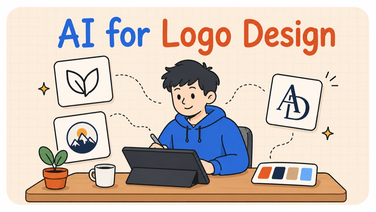
A logo prompt should do more than ask for something “modern” or “professional.” It should give you a visual direction you can actually try: a bold symbol and name, a spare line drawing, a geometric mark, or lettering with its own character.
The AI logo design prompts below supply the drawing style, composition, and finishing instructions. Fill in your business details, choose a subject and colors, and generate a first direction. Each template includes a completed example you can switch to in the same prompt box.
Jump to the eight prompts · Prepare your logo files
A Logo Prompt With a Clear Direction
For a fictional dumpling restaurant called FOLD, “make a modern restaurant logo” leaves the visual treatment wide open. An icon-and-name brief gives it a clearer direction:
Create an icon-and-name logo for “FOLD”, a neighborhood restaurant serving handmade dumplings. The icon depicts a pleated crescent dumpling. Draw it as a compact, distinctive silhouette with broad curves and just enough internal detail to identify the subject. Pair it with the exact name “FOLD” in substantial, slightly rounded sans-serif lettering. Give the icon and letters a similar visual weight and a shared character, with carefully balanced spacing. Arrange the icon to the left of the name in one horizontal composition. Use solid vermilion red on a plain white background. Flat artwork with clean edges; no tagline, surrounding frame, gradients, shadows, or mockup.
↓

The dumpling gives the name a visual partner. Broad curves connect the icon with the rounded lettering, and one strong color holds the composition together. You can use the same template for a different business without specifying every curve yourself.
What to Fill In
- Your business and name. Say what you offer and, where useful, who it is for. “A neighborhood restaurant serving handmade dumplings” is enough context to begin.
- A subject. Choose something connected to your product, service, name, or story: a dumpling for a restaurant, a wave for swimwear, or a teapot for a tea shop. You only need to name it; the template describes how to draw it. If you want the identity to come from the name itself, start with a wordmark or monogram.
- Your colors. Use a named color or a short palette. If you haven't chosen one, start with charcoal on white so you can judge the shape first.
Choose the style before generating. A line icon feels light and open; a geometric mark is solid and structured; a mascot introduces a character. The templates are starting directions, so pick the one that fits the impression you want your business to make.
Copy-Paste Logo Prompts by Type
Choose Template to fill in your details or Example to see a completed prompt. Copy copies the version showing. Paste it into your tool’s image-generation mode.
1. Icon and Name (Combination Mark)
A bold, compact symbol paired with clear lettering. Use this when you want the business name and a visual identity together, ready to judge as a website header or shop sign.
Create an icon-and-name logo for “[NAME]”, [BUSINESS]. The icon depicts [SUBJECT]. Draw it as a compact, distinctive silhouette with broad curves and just enough internal detail to identify the subject. Pair it with the exact name “[NAME]” in substantial, slightly rounded sans-serif lettering. Give the icon and letters a similar visual weight and a shared character, with carefully balanced spacing. Arrange the icon to the left of the name in one horizontal composition. Use solid [COLOR] on a plain white background. Flat artwork with clean edges; no tagline, surrounding frame, gradients, shadows, or mockup.
Filled example
Create an icon-and-name logo for “FOLD”, a neighborhood restaurant serving handmade dumplings. The icon depicts a pleated crescent dumpling. Draw it as a compact, distinctive silhouette with broad curves and just enough internal detail to identify the subject. Pair it with the exact name “FOLD” in substantial, slightly rounded sans-serif lettering. Give the icon and letters a similar visual weight and a shared character, with carefully balanced spacing. Arrange the icon to the left of the name in one horizontal composition. Use solid vermilion red on a plain white background. Flat artwork with clean edges; no tagline, surrounding frame, gradients, shadows, or mockup.
The symbol should identify the subject without needing the name to explain it. Check that neither the icon nor the lettering overwhelms the other.
2. Minimal Line Icon
An airy, drawing-led mark with smooth curves and an even stroke. The template supplies the line treatment; you supply a subject that belongs to your business.
Design a minimal line-art logo depicting [SUBJECT] for [BUSINESS]. Capture the subject with a few smooth, confident contour lines of consistent medium weight. Use rounded line endings and flowing joins. Leave generous open space between strokes and remove small interior details, keeping the features that make the subject recognizable. Give the outline a distinctive overall shape rather than illustrating every part. Render one centered icon in [COLOR] on a plain white background. Linework only, with no filled areas, lettering, decorative border, shading, or mockup.
Filled example
Design a minimal line-art logo depicting a teapot for an independent loose-leaf tea shop. Capture the subject with a few smooth, confident contour lines of consistent medium weight. Use rounded line endings and flowing joins. Leave generous open space between strokes and remove small interior details, keeping the features that make the subject recognizable. Give the outline a distinctive overall shape rather than illustrating every part. Render one centered icon in dark olive green on a plain white background. Linework only, with no filled areas, lettering, decorative border, shading, or mockup.
View it at a small size. The outline should stay connected and readable, with enough space between nearby strokes.
3. Geometric Mark
A solid, graphic symbol made from clean curves and simple forms. This prompt turns a familiar subject into geometry without asking you to design the geometry yourself.
Create a geometric logo symbol depicting [SUBJECT] for [BUSINESS]. Build a compact, modular emblem from solid circular segments and straight cuts. Repeat the same curve radii and use evenly spaced gaps so the whole mark has a clear visual rhythm. Keep the subject recognizable through its silhouette rather than small details. Use blunt, substantial forms and a balanced, nearly square composition. Render one symbol in solid [COLOR] on a plain white background with generous clear space. No lettering, enclosing border, tapered flourishes, gradients, shading, or mockup.
Filled example
Create a geometric logo symbol depicting a breaking wave for a swimwear brand for ocean swimmers. Build a compact, modular emblem from solid circular segments and straight cuts. Repeat the same curve radii and use evenly spaced gaps so the whole mark has a clear visual rhythm. Keep the subject recognizable through its silhouette rather than small details. Use blunt, substantial forms and a balanced, nearly square composition. Render one symbol in solid deep cobalt blue on a plain white background with generous clear space. No lettering, enclosing border, tapered flourishes, gradients, shading, or mockup.
The result should read as a single symbol, not a collection of shapes. If it becomes too abstract, attach the image and ask for the subject’s defining feature to be clearer.
4. Negative Space Mark
Two related subjects sharing one shape: one in color, the other revealed by the space around it. Choose subjects with a connection to your business; the prompt works out how to combine them.
Design a negative-space logo that combines [SUBJECT ONE] and [SUBJECT TWO] for [BUSINESS]. Find a simple shared silhouette: draw one subject in solid color and reveal the other through the open space between its parts. Choose whichever positive-and-negative arrangement gives the clearest, most natural connection. The two subjects should share an edge, not appear as separate illustrations or an icon inside a frame. Use a compact silhouette, smooth curves, and generous open areas. Keep only the features needed to recognize both subjects. One centered mark in solid [COLOR] on a plain white background. Flat, even color throughout, with no lettering, texture, shading, outlines, or mockup.
Filled example
Design a negative-space logo that combines a leaf and a fountain-pen nib for a botanical stationery shop. Find a simple shared silhouette: draw one subject in solid color and reveal the other through the open space between its parts. Choose whichever positive-and-negative arrangement gives the clearest, most natural connection. The two subjects should share an edge, not appear as separate illustrations or an icon inside a frame. Use a compact silhouette, smooth curves, and generous open areas. Keep only the features needed to recognize both subjects. One centered mark in solid forest green on a plain white background. Flat, even color throughout, with no lettering, texture, shading, outlines, or mockup.
The example connects a pen nib with a leaf for botanical stationery. The shared contour matters: look for two readings of one shape, rather than a large symbol with a smaller picture inserted into it.
5. Wordmark
Distinctive lettering that carries the name on its own. This version uses a warm editorial serif: substantial strokes, softly flared ends, and a measured rhythm.
Design a wordmark reading exactly “[NAME]” for [BUSINESS]. Draw custom-feeling serif lettering with substantial strokes, gently flared terminals, and softly curved joins. Balance the letters optically, with a consistent rhythm of open spaces. Give one letter a subtle, memorable detail that grows naturally from its shape, while keeping the entire name immediately readable. The result should feel assured, warm, and contemporary. Set the name on one horizontal line in solid [COLOR] on a plain white background. Show only the wordmark, without an icon, tagline, flourishes around the letters, texture, gradients, or mockup.
Filled example
Design a wordmark reading exactly “Morrow” for an independent publisher of contemporary fiction. Draw custom-feeling serif lettering with substantial strokes, gently flared terminals, and softly curved joins. Balance the letters optically, with a consistent rhythm of open spaces. Give one letter a subtle, memorable detail that grows naturally from its shape, while keeping the entire name immediately readable. The result should feel assured, warm, and contemporary. Set the name on one horizontal line in solid ink blue on a plain white background. Show only the wordmark, without an icon, tagline, flourishes around the letters, texture, gradients, or mockup.
Check letter by letter, then look at the spaces between them. For a different direction, replace the serif treatment with “wide, rounded lowercase sans-serif lettering” while keeping the name and business unchanged.
6. Badge / Emblem
A contained name-and-symbol composition with the character of a well-drawn stamp. Broad lettering and a single illustration keep it readable without filling every gap.
Design a circular badge logo for “[NAME]”, [BUSINESS]. Set the exact name “[NAME]” in sturdy, rounded uppercase lettering along the upper arc. Place [SUBJECT] in the center as a bold cut-paper-style symbol: a flat silhouette with no more than three broad interior cuts for its defining features. Match the weight of the lettering, symbol, and single outer ring. Leave generous space around the symbol and between the letters. Use [COLORS] as flat ink colors on plain white. The character is a confident, warmly drawn shop stamp. One complete badge with no extra words, dates, decorative filler, fine lines, hatching, texture, lighting, or mockup.
Filled example
Design a circular badge logo for “SLOW RISE”, a neighborhood sourdough bakery. Set the exact name “SLOW RISE” in sturdy, rounded uppercase lettering along the upper arc. Place a round scored loaf of bread in the center as a bold cut-paper-style symbol: a flat silhouette with no more than three broad interior cuts for its defining features. Match the weight of the lettering, symbol, and single outer ring. Leave generous space around the symbol and between the letters. Use dark brown and warm ochre as flat ink colors on plain white. The character is a confident, warmly drawn shop stamp. One complete badge with no extra words, dates, decorative filler, fine lines, hatching, texture, lighting, or mockup.
Keep the badge’s name short enough to read comfortably. Save opening dates, locations, and taglines for supporting copy rather than squeezing them into the mark.
7. Monogram
Initials drawn together as a compact identity. The treatment is restrained and architectural, with shared strokes and open spaces rather than elaborate ornament.
Create a monogram using exactly the initials “[INITIALS]” for [BUSINESS]. Draw sturdy uppercase serif letters with moderate contrast between thick and thin strokes. Join the letters through one shared stroke or a simple overlap, making a compact, balanced silhouette while keeping each initial identifiable. Align the tops and baselines, keep the interior spaces open, and give the joins the same finish as the rest of the lettering. The result should feel composed and contemporary. Solid [COLOR] on a plain white background. One centered monogram, without a full business name, enclosing frame, extra symbols, texture, shadows, or mockup.
Filled example
Create a monogram using exactly the initials “SL” for an interior design practice working on residential spaces. Draw sturdy uppercase serif letters with moderate contrast between thick and thin strokes. Join the letters through one shared stroke or a simple overlap, making a compact, balanced silhouette while keeping each initial identifiable. Align the tops and baselines, keep the interior spaces open, and give the joins the same finish as the rest of the lettering. The result should feel composed and contemporary. Solid charcoal on a plain white background. One centered monogram, without a full business name, enclosing frame, extra symbols, texture, shadows, or mockup.
Read the initials without looking at the prompt. If one disappears into the other, attach the result and ask to open that join while preserving the overall arrangement.
8. Mascot Logo
A character with enough personality to represent a business and enough simplicity to work as a mark. This prompt supplies a friendly expression, compact pose, and bold drawing style.
Design a simple cartoon mascot logo of [CHARACTER] for [BUSINESS]. Show only the head and upper shoulders, with a friendly, self-assured expression. Use the graphic economy of a classic animation character: a rounded head, broad muzzle or face, simple oval eyes, and a small expressive smile. Build the character from large, smooth color shapes with a thick, even outline. Indicate fur or feathers with two or three large tufts in the outer silhouette; keep the interior face free of small texture marks. Use flat [COLORS] with small white highlights. One centered mascot on a plain white background. No lettering, costume, props, individual hairs, hatching, gradients, shading, or mockup.
Filled example
Design a simple cartoon mascot logo of a scruffy terrier for a neighborhood dog-grooming salon. Show only the head and upper shoulders, with a friendly, self-assured expression. Use the graphic economy of a classic animation character: a rounded head, broad muzzle or face, simple oval eyes, and a small expressive smile. Build the character from large, smooth color shapes with a thick, even outline. Indicate fur or feathers with two or three large tufts in the outer silhouette; keep the interior face free of small texture marks. Use flat warm tan and dark navy with small white highlights. One centered mascot on a plain white background. No lettering, costume, props, individual hairs, hatching, gradients, shading, or mockup.
The character should still have an expression when it is small. For recurring poses and appearances, use our AI character sheet prompts to develop it beyond the logo.
Which AI Tool Should You Use for Logo Design?
Start with an image tool you already have access to, such as ChatGPT or Gemini, so you can generate a concept and continue with image-based edits. Ideogram is another option for lettering-led designs; its typography guidance recommends stating the text clearly, quoting it, and describing its appearance and placement.
For an icon-and-name logo, you can also generate the symbol alone and add the name as editable type in a design editor. That gives you direct control over the font, spelling, and spacing.
Refine the Direction You Like
Download the logo you want to develop and attach that image to your next request. If it is already in the conversation, identify the exact image you want edited. Give one specific instruction and preserve the rest.
Edit the attached logo. [CHANGE]. Preserve the business name, lettering, overall composition, and all features not mentioned in the change. Return one revised logo on the same background, at the same size and position.
Filled example
Edit the attached logo. Change only the vermilion red artwork to dark navy. Preserve the business name, lettering, overall composition, and all features not mentioned in the change. Return one revised logo on the same background, at the same size and position.
To explore variations around the selected design, attach it and use this prompt:
Use the attached logo as the reference. Create a 2 × 3 grid of six variations of its icon, keeping the same subject, drawing style, and color palette. Explore small differences in silhouette, proportions, and the spacing of internal details. Keep each variation recognizable as part of the same identity, with a similar level of simplicity and visual weight. Show one complete icon centered in each cell, all at the same scale with generous white space. Leave out the business name, captions, numbers, grid lines, shadows, and mockups. Return one image containing all six icons.
Pick one icon from the grid, crop it, and attach that crop when asking for further changes or a standalone version.
Useful changes are easy to compare: open the gap between the icon and name, make a thin outline heavier, simplify a busy part of the symbol, or change the color. Keep the original download alongside the edit so you can decide which works better.
If the idea itself feels wrong, try a different subject or another template. If you like the idea but the details are off, keep working from the image.
From AI Concept to Usable Logo File
You’ve got a design you want to use. Now prepare it for your website, invoices, and signage:
- Strip the background. If your mark is sitting on white, save a transparent version for placing it on your own backgrounds. Run it through our free Background Remover — Standard mode runs entirely in your browser, without uploading your image. A free account is required.
- Vectorize it. Three routes: generate a new version of the concept with Recraft’s vector generator for SVG output; run your chosen PNG through an auto-tracer such as Illustrator’s Image Trace or Inkscape’s free Trace Bitmap tool; or hire a designer on Fiverr, Upwork, or elsewhere to rebuild it as a clean vector. A rebuild can preserve the direction you chose while refining the curves, spacing, and lettering. You’ve done the creative direction and selected the concept; the designer’s job is to finish it for use.
- Add your type. If you generated an icon-only mark, choose a licensed font for your business name and save the combination as your primary lockup.
- Run the small test. Shrink the icon to 16 pixels — favicon size. If it turns to mush, simplify: fewer shapes, thicker lines, more contrast. Check the full logo separately at the size you’ll use in a website header or on an invoice.
Keep the editable master alongside your exported PNGs. For signage or other print work, ask the printer which file format and color setup they need.
Before You Use the Logo Commercially
There are three things to check: the tool’s terms, rights in the artwork, and whether the name and mark conflict with another business. The points below are U.S.-focused general information, not legal advice.
Check your tool and asset licenses. Review commercial-use terms for the plan you used, along with licenses for fonts and any references you supplied. Permission to use a generator’s output is separate from clearance to use a particular brand mark.
Understand what copyright covers. The U.S. Copyright Office says protection depends on sufficient human-authored expression. Original human modifications or arrangements may qualify; supplying prompts alone does not. It also notes that very simple logo designs may lack copyright protection, even apart from AI. Keep records of your creative contributions, and seek advice if ownership is important to the project.
Check the name and mark before investing in them. Search the USPTO trademark database and look for similar names and designs used with related goods or services. Search beyond that database too: the USPTO’s clearance guidance includes state records and the internet. A trademark attorney can help assess conflicts, distinctiveness, and registration options before you commit to packaging or signage.
Put the Brief to Work
Choose the logo type that fits your business, fill in the prompt, and make a first version. Refine the direction you like, prepare the files for their intended uses, and keep the working source for later changes.
If you want the judgment behind image direction — briefing, references, and reviewing what comes back — that is what Module 3: AI Creative covers.
Frequently Asked Questions
What is a good AI prompt for logo design?
Use a prompt that names the logo type, describes a clear visual style, and supplies your business, subject, and colors. The templates above include the composition and drawing instructions, so you can fill in your details without designing the mark yourself. Include the exact spelling wherever a name or initials appear.
How do I make an AI logo look less generic?
Give it something specific to your business: a relevant subject, a name with a clear lettering treatment, or a recognizable product detail. Pick a defined style rather than combining a long list of adjectives. Once you find a promising direction, attach the image and refine the feature that could make it more distinctive.
How do I get my business name to appear correctly?
Put the exact name in quotation marks near the start of the prompt and describe its placement and lettering style. Check every character. For a symbol-and-name logo, adding the name as editable type in a design editor gives you direct control over spelling and spacing.
Can I get a transparent PNG logo?
Yes. Export with transparency from your design editor, or remove the background from a flattened image first. Inspect the edges against both light and dark backgrounds before using the file. A clean cutout should preserve the intended gaps, fine lines, and lettering.
How do I turn an AI logo into an SVG?
For a simple high-contrast symbol, import the image into Inkscape and use Path → Trace Bitmap. Inspect and clean the resulting shapes, remove the underlying image from the finished artwork, and save as SVG. Detailed logos and custom lettering may benefit from a manual redraw instead.
Can I use or trademark an AI-generated logo?
Check the generator’s terms, any font or reference licenses, and potential conflicts with existing brands before using it. Trademark eligibility depends on the mark and how it is used, not simply on whether an AI tool was involved. Registration is not automatic. For a mark you’re investing in, get advice appropriate to your jurisdiction.
Tags
- AI prompts
- logo design
- branding
- AI images
- AI image generation
- visual content
- small business